La Souq
Building a specialty café's visual language around light, colour and the drink itself.
- Role
- Agency work — account run through Illustrated, where Abby works part time as a social and content lead.
- Scope
- Content production, art direction, photography, social publishing
- Client of
- Illustrated
The assignment
Specialty café content is a crowded genre — the same overhead flat lay, the same pour shot, the same beige table.
La Souq needed a look that was recognisable in a feed at thumbnail size, built around the products that actually sell.
The thinking
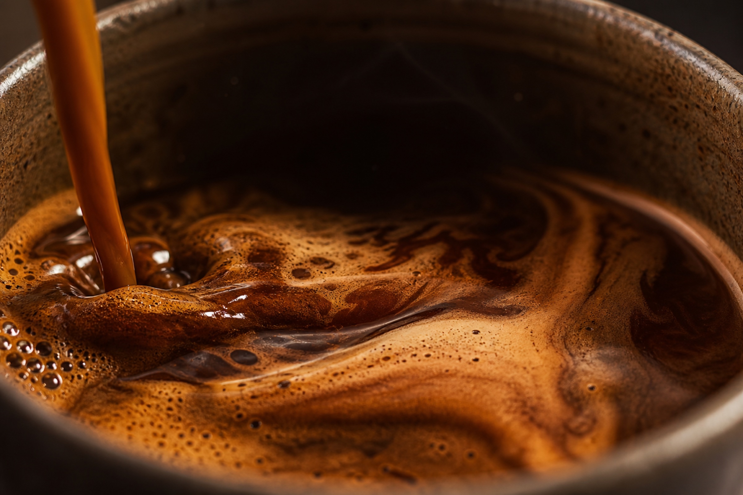
We shot for hard daylight instead of soft ambient light: real shadow, real contrast, colour that survives compression.
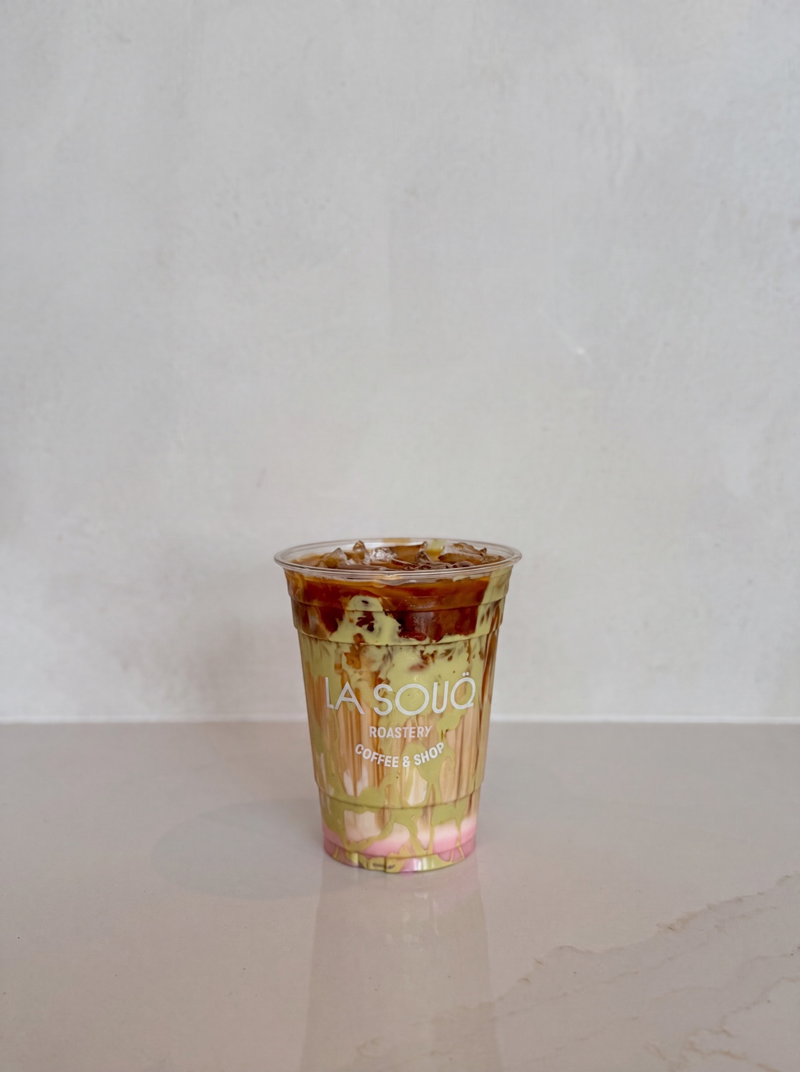
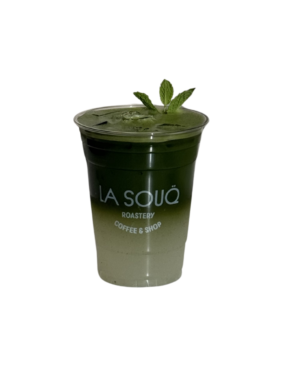
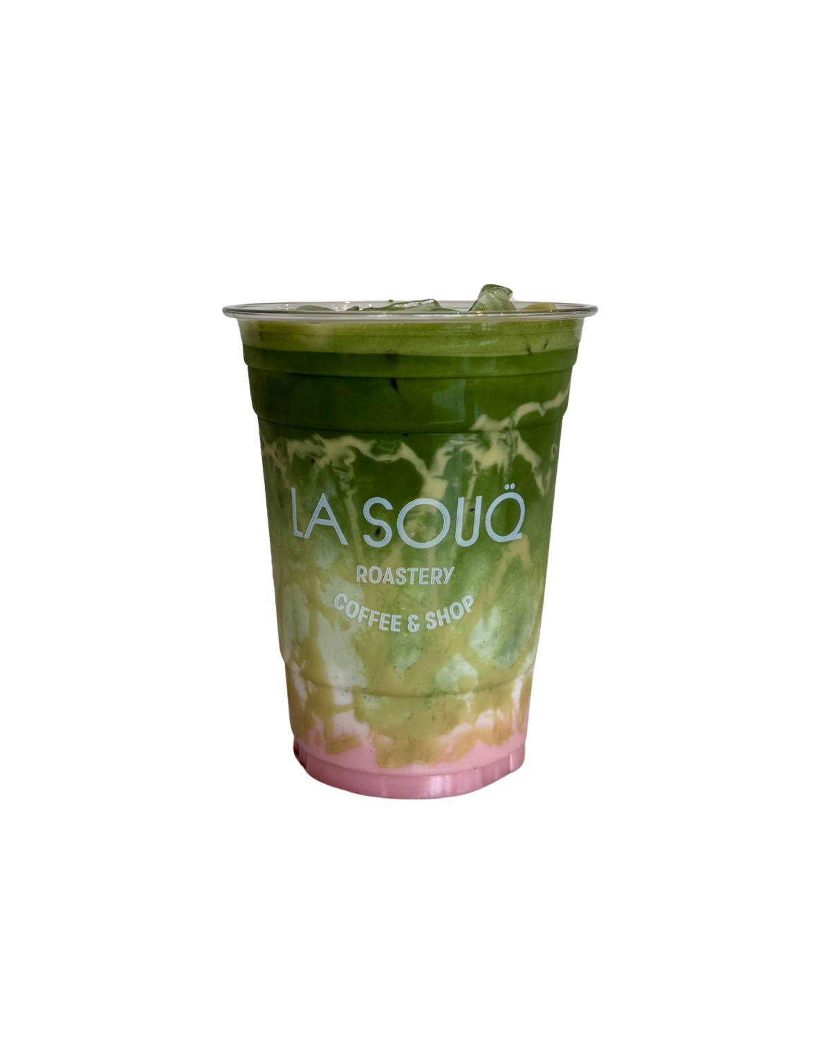
Drinks were treated as the subject rather than the prop — layered matcha, mint, glassware, condensation. Cut-outs were built from the same shoots so a single production day supplied both editorial posts and promotional graphics.
If the drink is the product, the drink is the art direction. Everything else is background.
The work
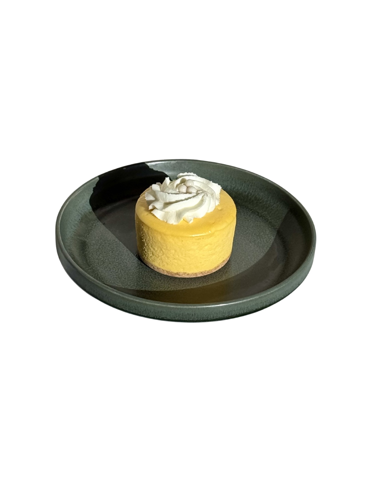
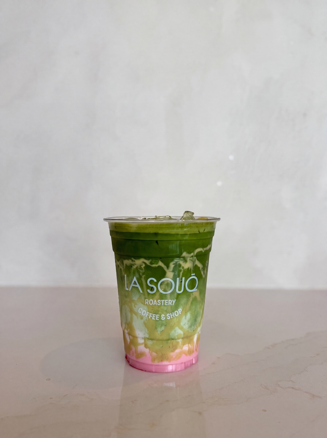
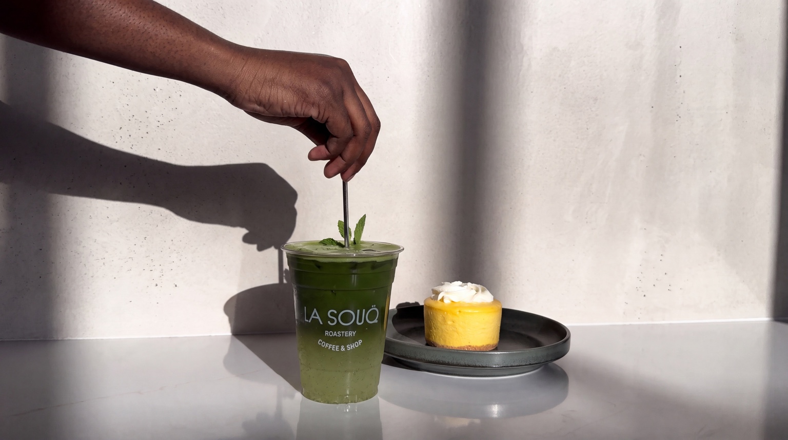
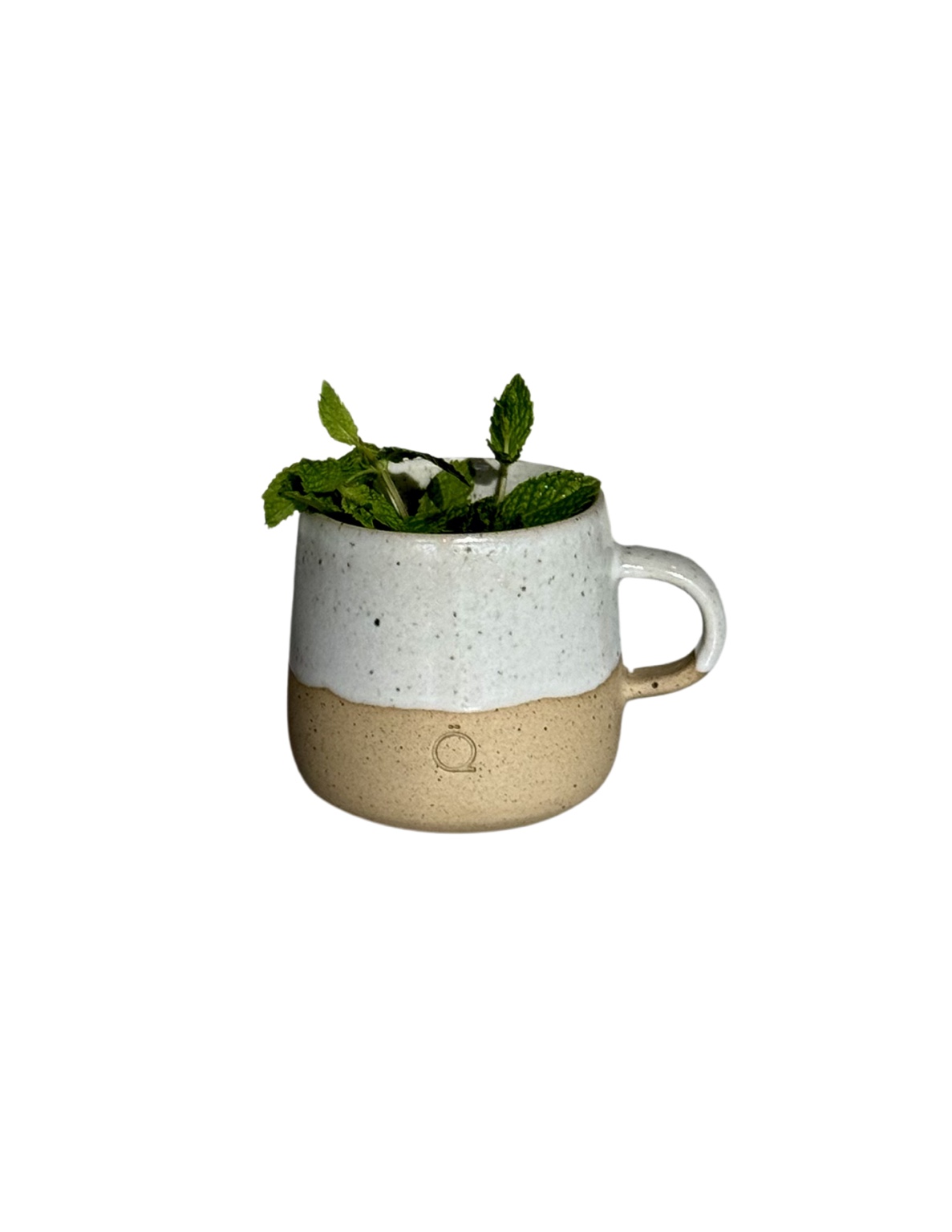
The outcome
La Souq now has a production system rather than a shot list: one shoot day yields editorial frames, cut-out assets and promotional layouts that all look like the same brand.