Gravel & Glory
A boxing club built on discipline and consequence — the opposite of a boutique fitness brand.
- Role
- Self-initiated concept. Strategy, naming, identity, environment and membership system by AG&CO.
- Scope
- Positioning, identity, signage, poster campaign, membership kit, gym art direction
- Status
- Speculative — developed in-house to demonstrate a full brand build
The assignment
Boutique fitness sells euphoria: neon, candlelight, a playlist and a promise that it will feel amazing. Boxing gyms sell something else entirely, and most of them dress it up until it disappears.
Gravel & Glory keeps the hard part. The brand is built on the least marketable truth in fitness — that improvement is repetitive, unglamorous and earned.
The thinking
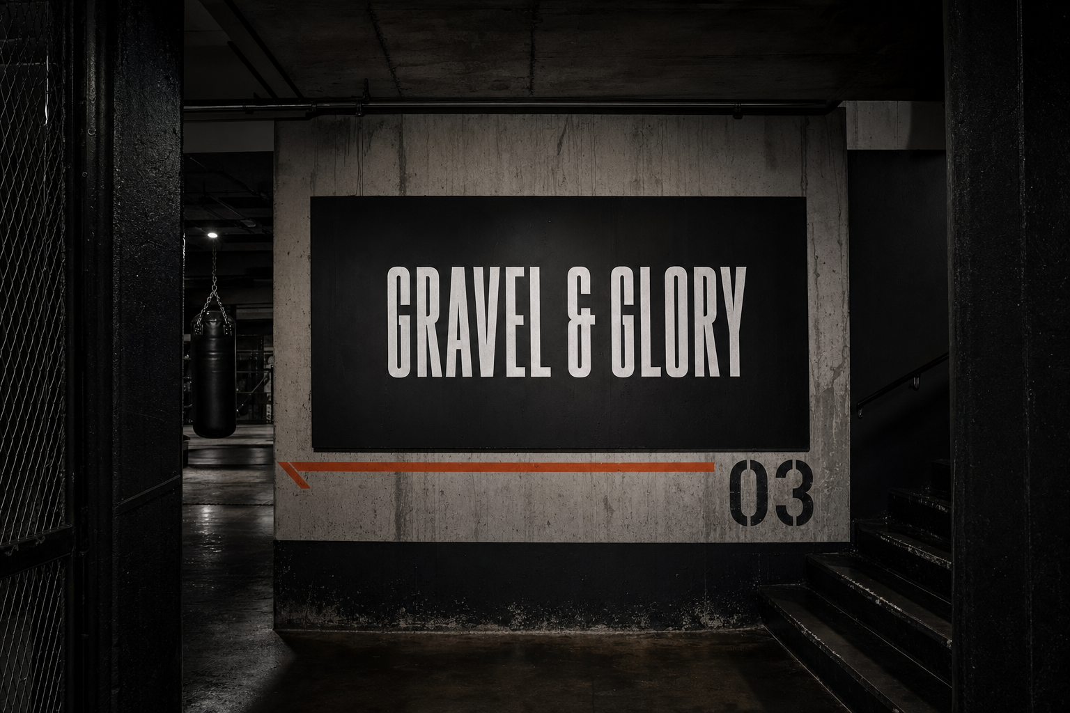
The system borrows from athletic institutions rather than studios: numbered rounds, printed schedules, painted-on walls, membership cards that look issued rather than sold.
One alarm orange against concrete grey and black. Condensed capitals. Copy written like instruction, not encouragement — the tone of a coach who has already told you twice.
You do not get glory. You get gravel, every session, until the glory is a by-product.
Palette
Brand system
Voice
- Register — Instructional, blunt, unsentimental
- Format — Numbered rounds, timed intervals, posted rules
- Never — Journey, self-care, transformation, sweat emoji
Environment
- Signage — Painted directly onto surfaces, no plaques
- Wayfinding — Numerals at architectural scale
- Membership — Issued card, stamped, deliberately analogue
The work



The outcome
Gravel & Glory demonstrates brand-building where the product is difficulty. Every asset — signage, poster, card, photograph — argues the same idea without ever softening it.
It is the counter-proposal to the entire boutique fitness aesthetic, and it is designed to be more believable than any of it.